Motorway is the UK's fastest-growing used-car marketplace, but once a sale was agreed, the experience went entirely offline. I defined the vision for the online experience as a critical business opportunity, secured exec buy-in, and established a new product vertical around it.
My Contributions
- Defined and led the last mile product vision
- Established reusable patterns adopted across adjacent verticals
- Sequenced delivery into modular releases
- Identified post-verification drop-off as a systemic risk before it was on the roadmap
Problem
- The final seller screen had 4× more page views than the homepage
- 100% of sales relied on WhatsApp and phone calls
- 56% of enquiries came from sellers unsure of next steps
- 25% cancellation rate and climbing
Vision & Planning
To align the organisation, I created a vision storyboard grounded in support data, dealer workflows, and seller interviews. I prioritised three systemic levers:
- Verified buyer & driver profiles to reduce the highest-friction anxiety moment
- Time-based milestones to decrease ambiguity and lower late-stage cancellations
- AI-assisted damage valuation to reduce negotiation disputes and justify price adjustments with evidence
Release 1: Setting expectations early
The verification screen became the obvious starting point: the surface already existed, and was where the journey effectively "ended". Crucially, it required no backend engineering, allowing us to deliver value immediately while engineering focused on validating the events architecture needed for the full vision.
I worked with Content and Ops to develop language that covered both transport paths — sellers arranging their own collection, and those using Motorway Move — giving sellers clarity on what collection day would look like regardless.
We immediately saw less people refreshing and navigating through the site trying to find the next step, which validated that clearer sequencing and upfront expectation-setting directly reduced confusion. Both buyers and agents reported fewer enquiries, a huge win for both the org, sellers, and buyers.
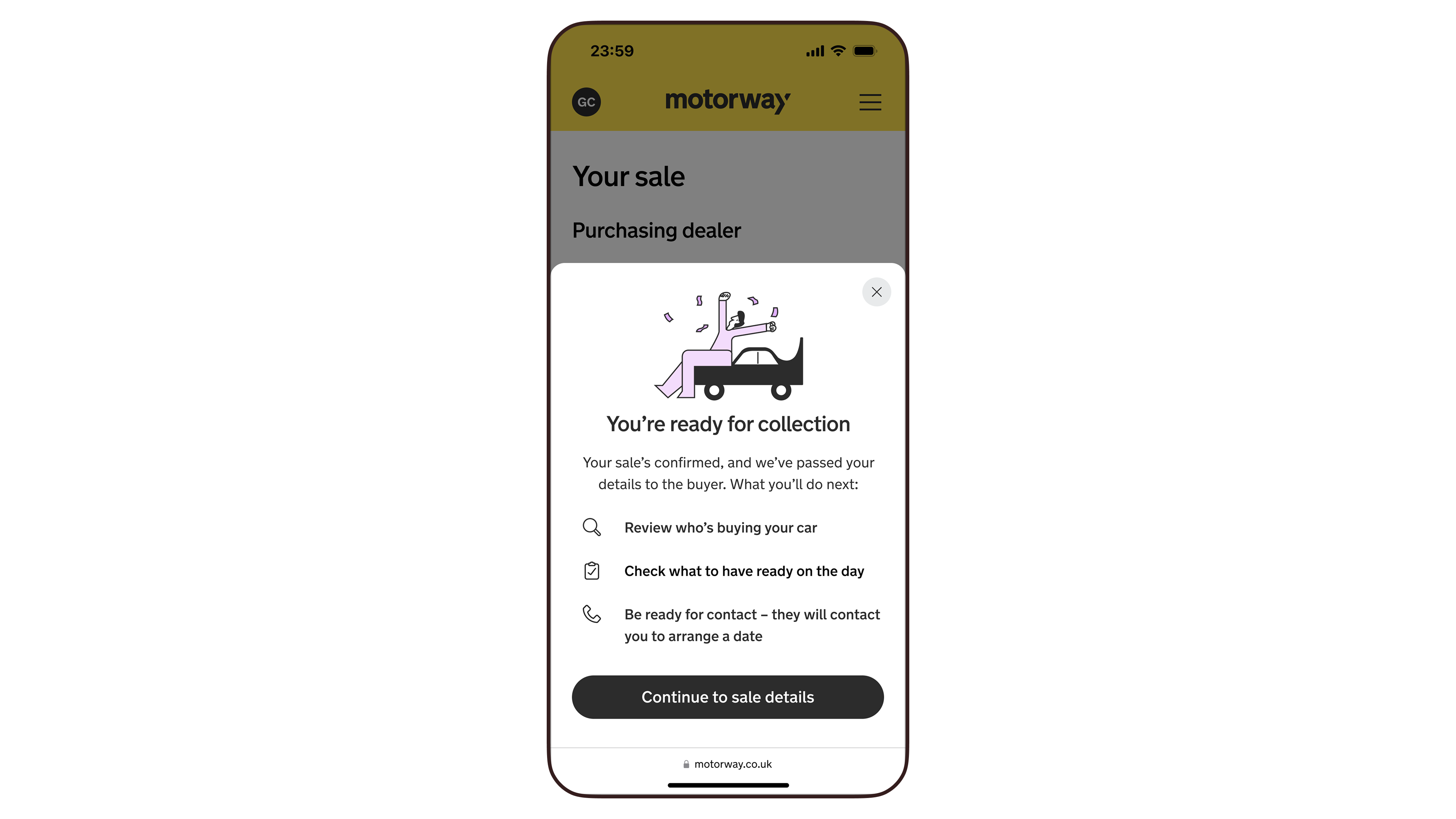
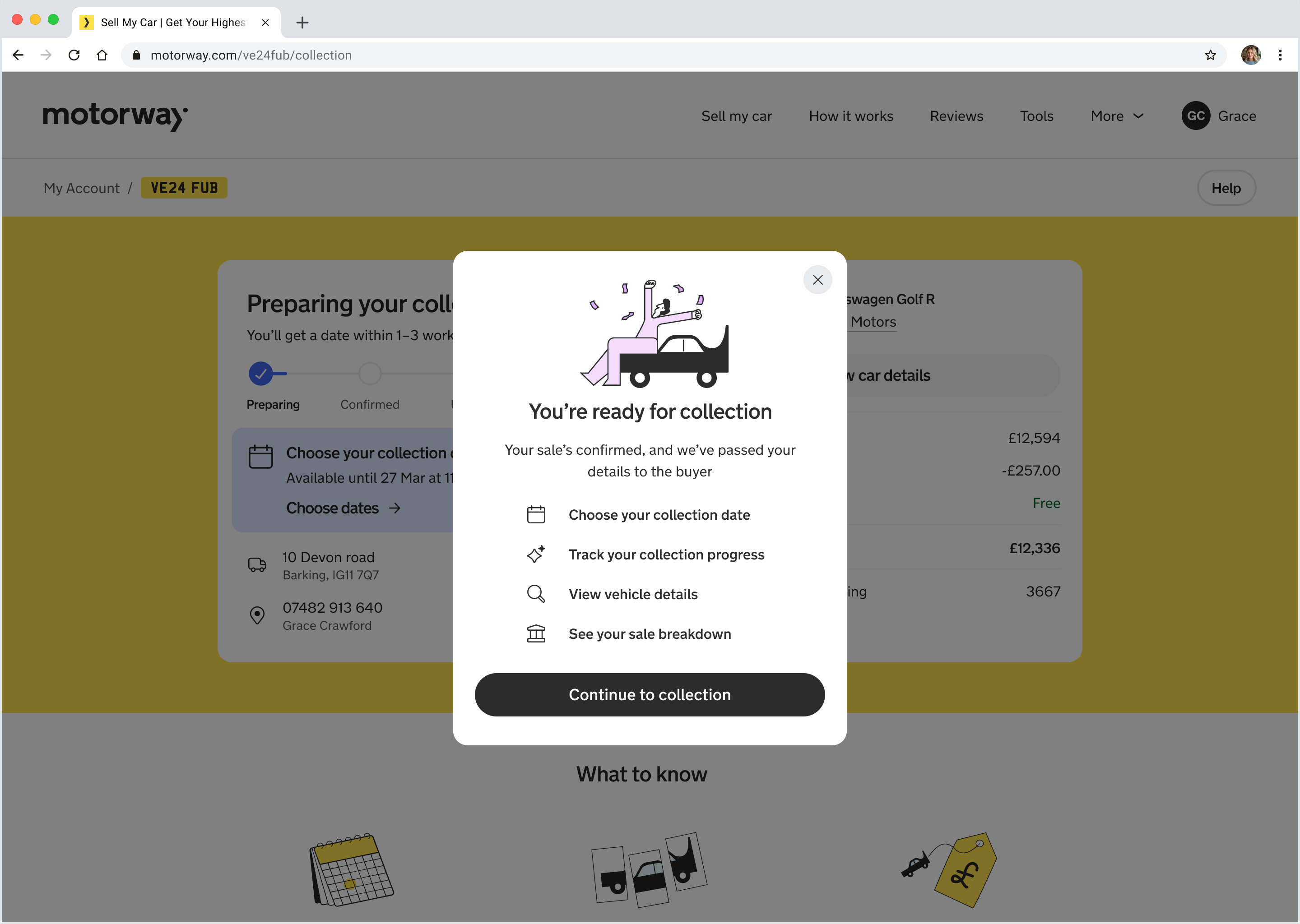
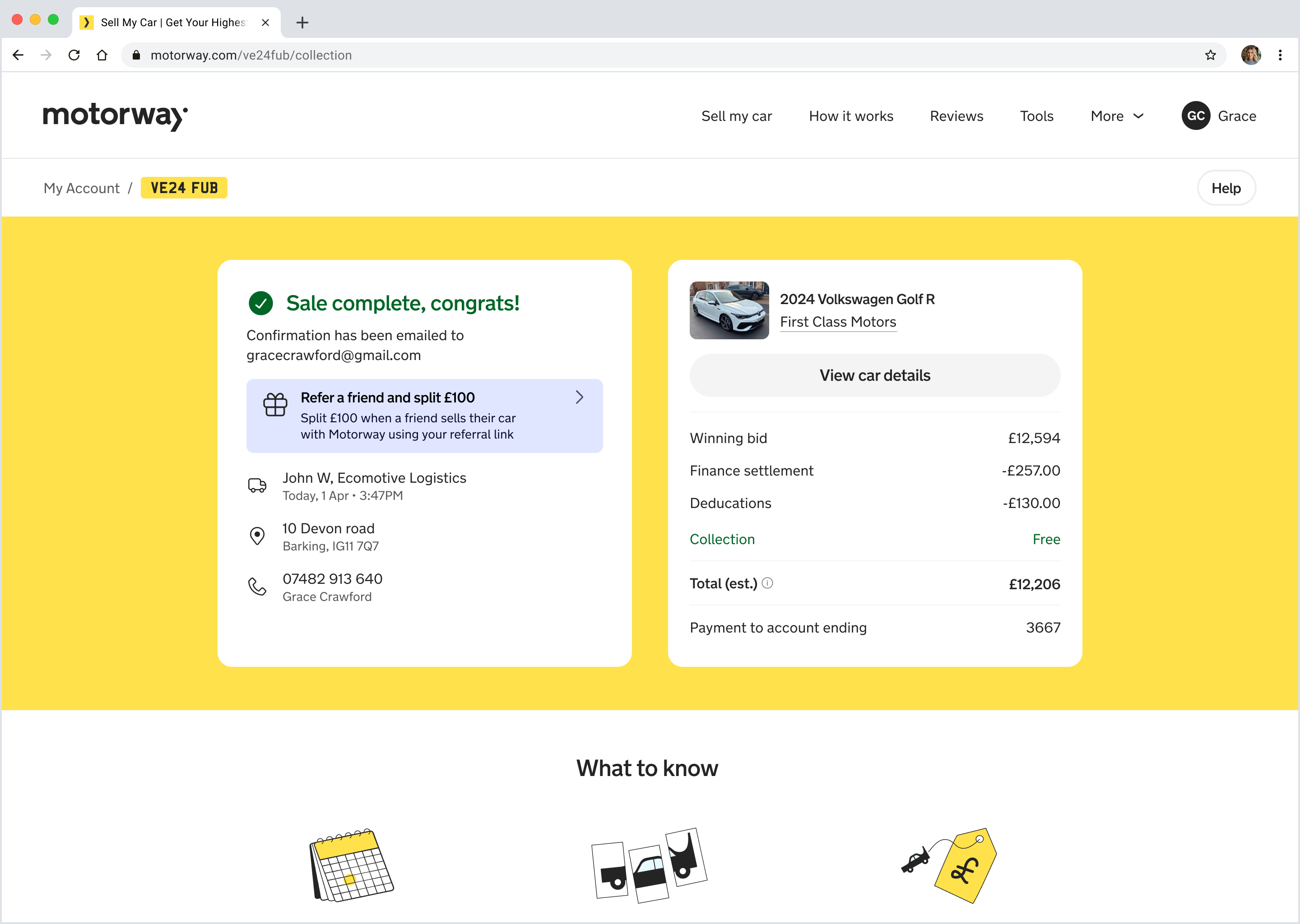
Release 2: Creating a guided handoff
The next project we sequenced was a refresh of how we handled a successful verification. Previously, sellers who passed verification landed on a static "Sale confirmed" screen. It was designed to feel celebratory but instead felt like a dead end which gave no context on what to do next.
I designed an intercept screen to transform this ambiguous moment into a guided handoff. It needed to accommodate multiple dealer workflows and set clear expectations before sellers entered the existing handover experience.
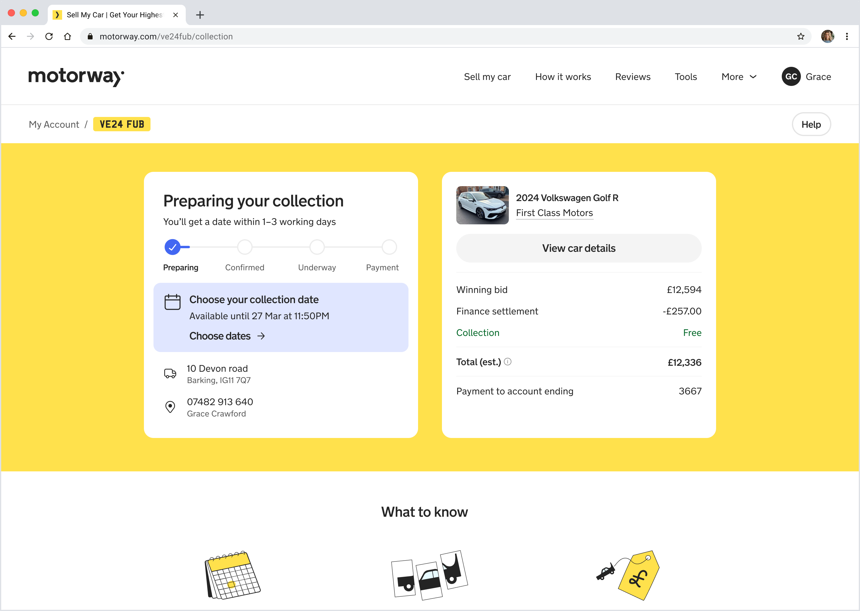
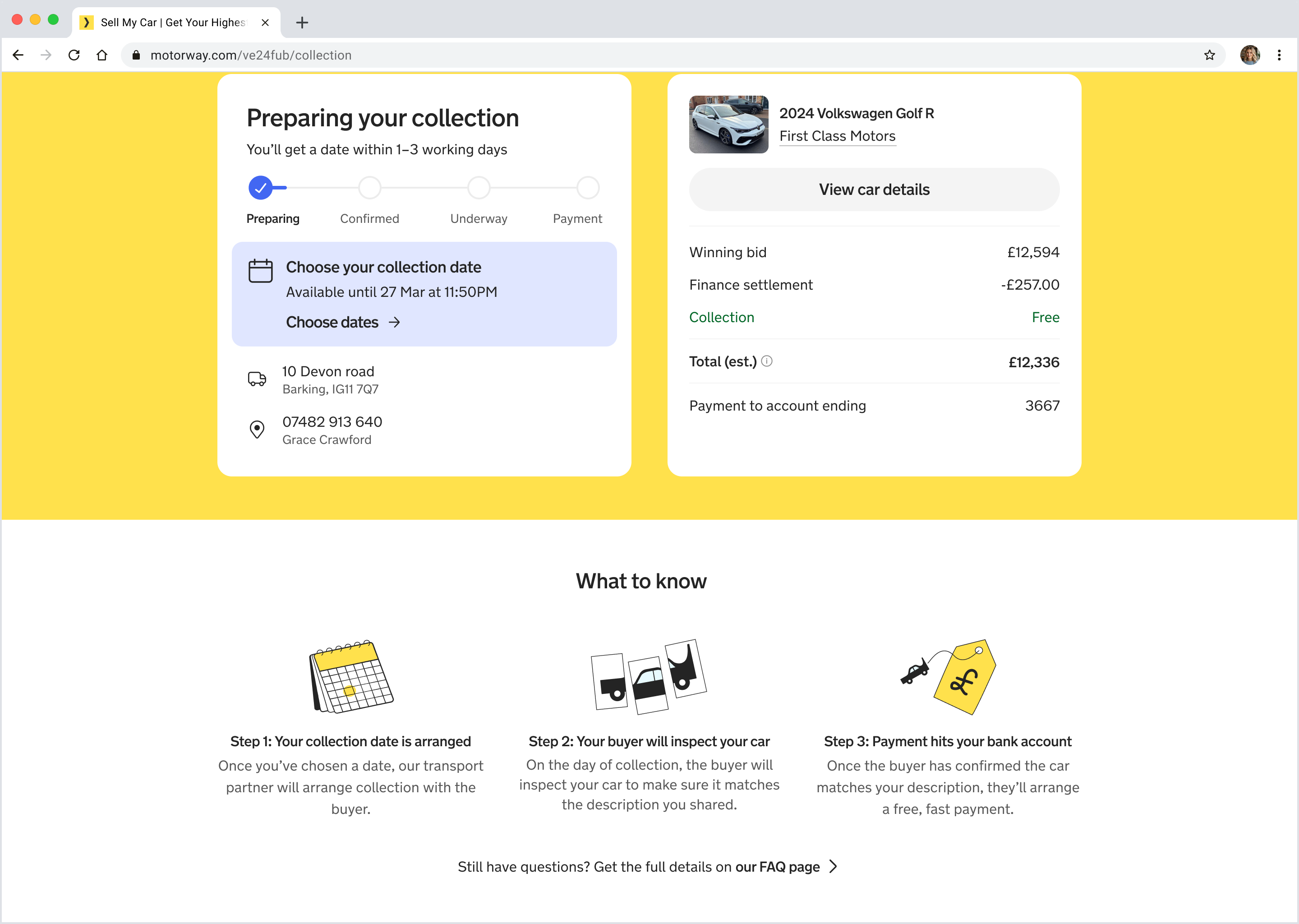
Release 3: A predictable, legible journey
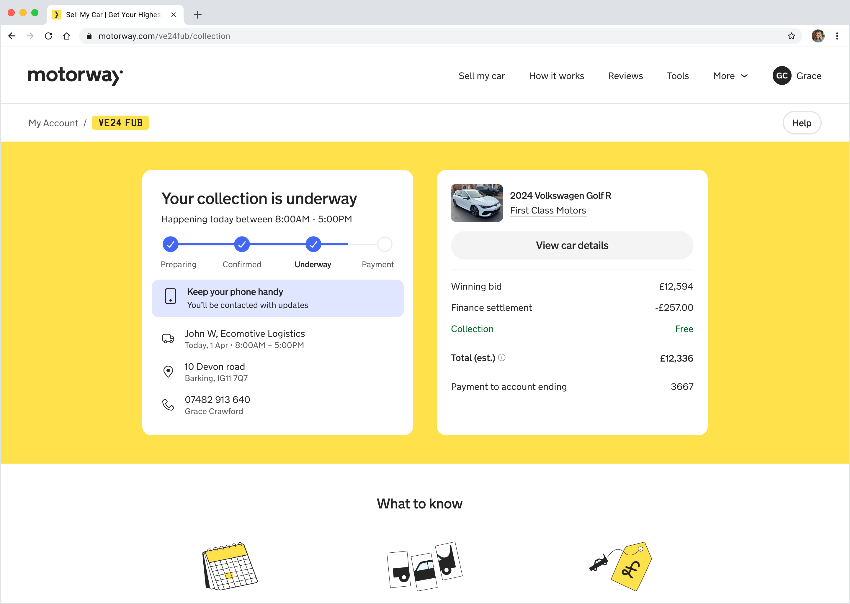
Next came the task of defining the new surfaces and information hierarchy across the last mile journey. There were dozens of backend events we could surface, but sellers don't think in internal logistics states — I kept the milestones aligned to predictable steps that online shoppers already recognise, and focused on showing momentum.
Through iteration, we identified four seller-centred moments that were stable regardless of operational complexity:
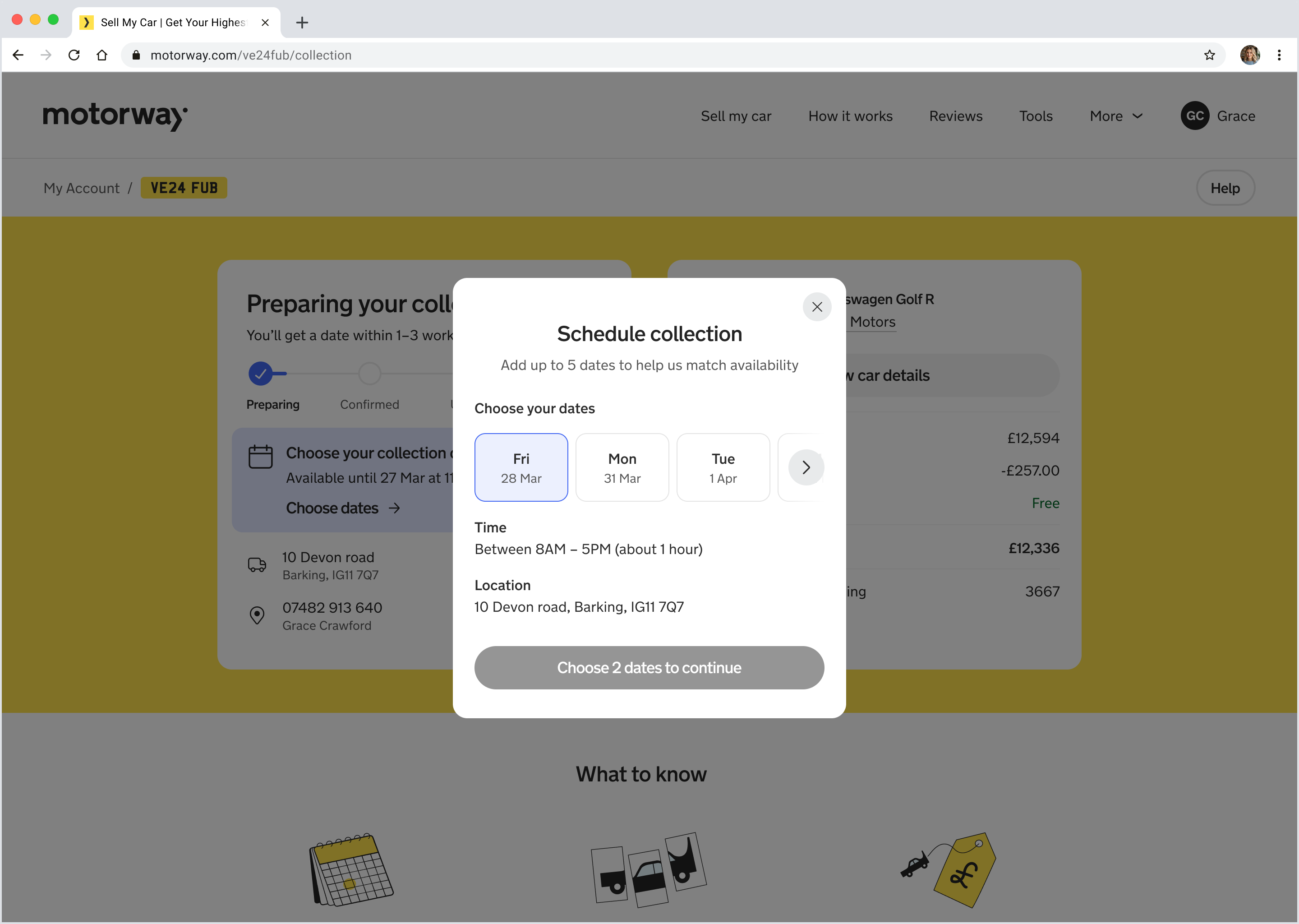
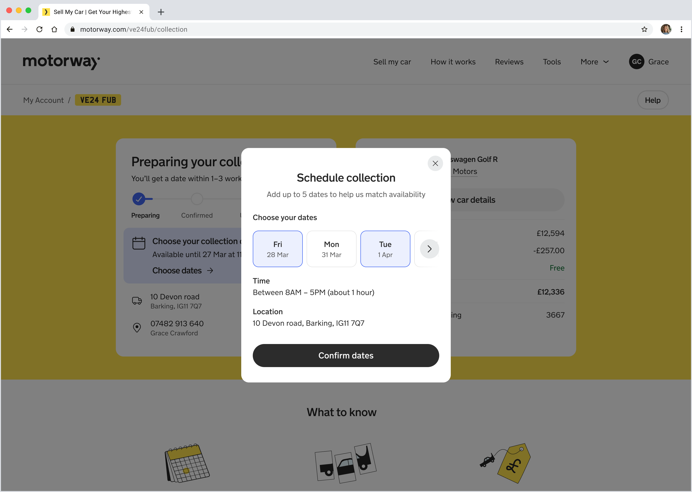
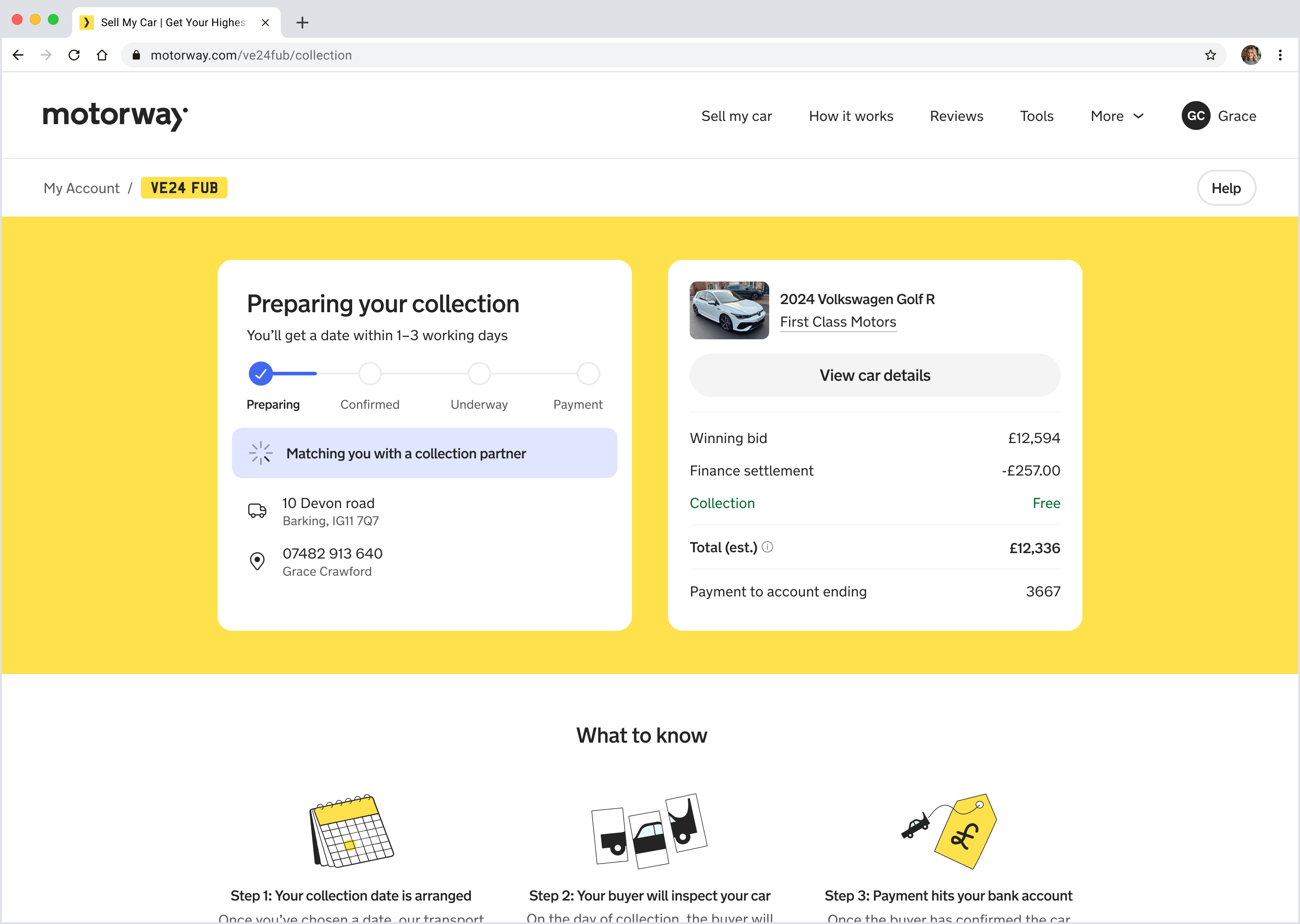
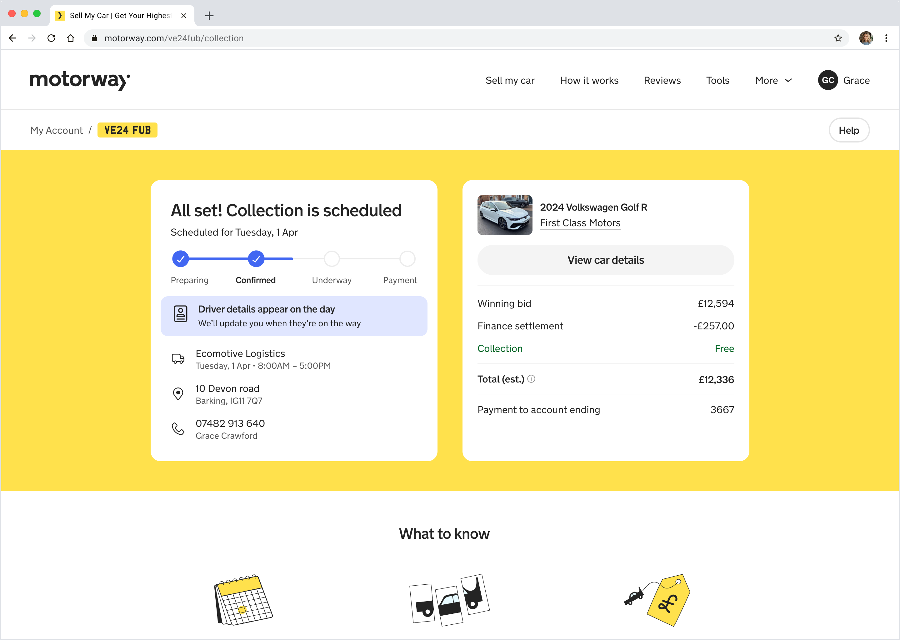
- Preparing your collection: User needs to choose a collection date
- Collection confirmed: Partner allocation happening behind the scenes.
- Collection underway: Driver is en-route or started collection
- Payment: Inspection complete, payment has been made.
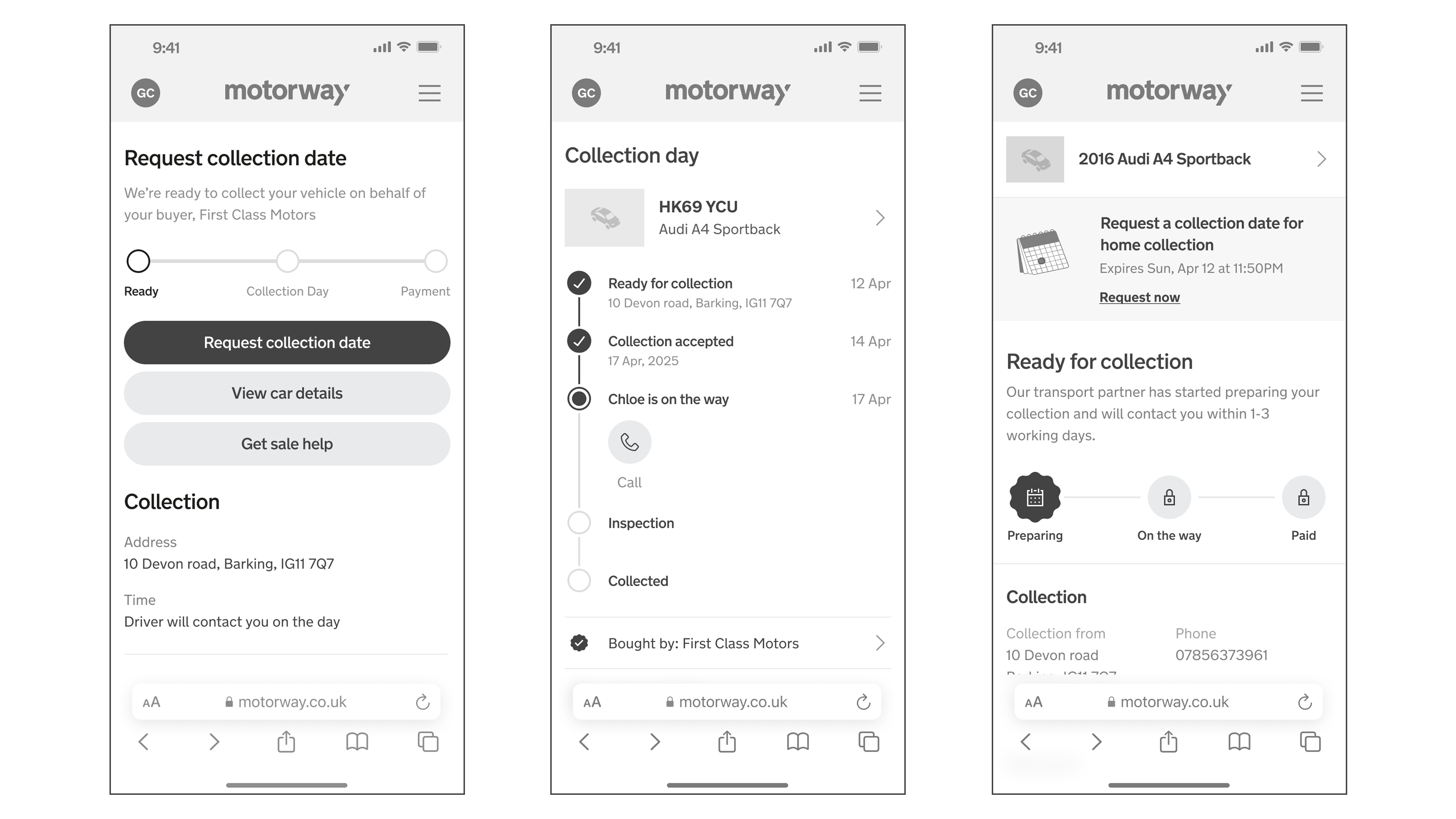
However, early explorations showed that milestones break if you try to stuff operational context inside them. We needed a structure that preserved the clarity of the milestones while still giving sellers the context they needed at critical moments.
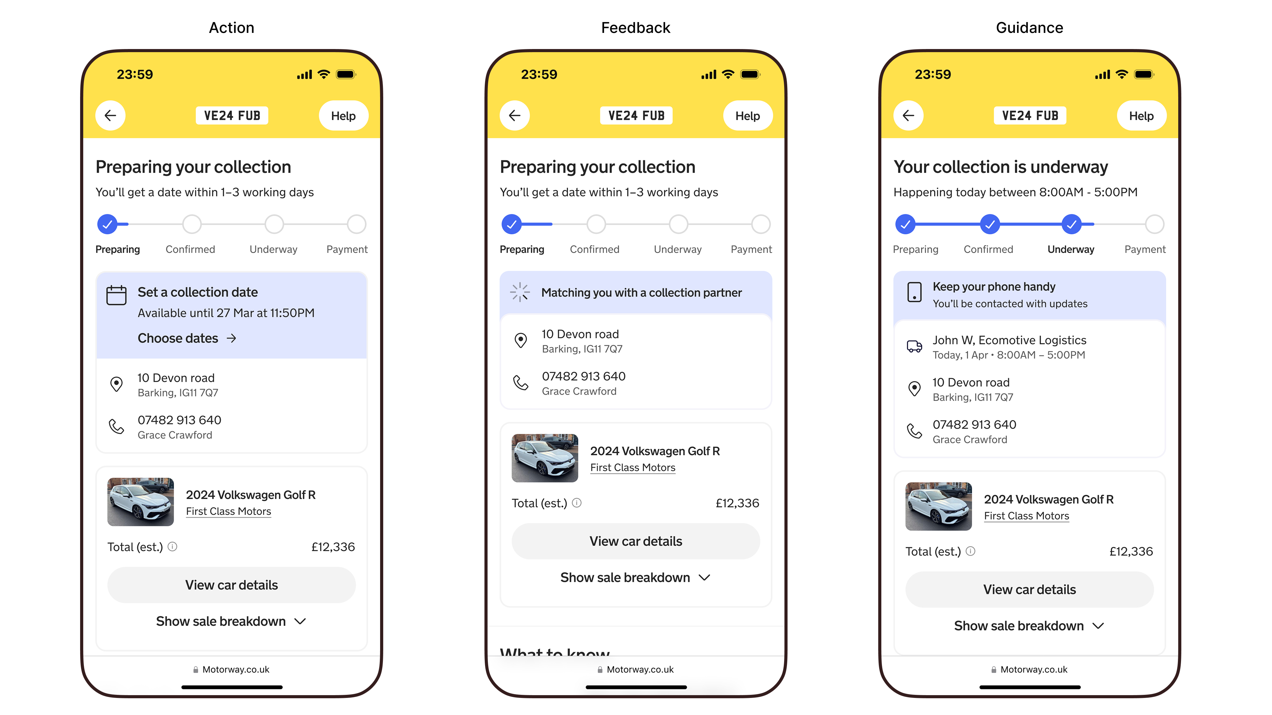
To achieve this, I reframed the milestone bar as sacred: a place for only status and time expectations. Everything else—contextual updates, time-based changes, or actions—needed to live elsewhere. This clarity let us reset the information architecture into 3 layers
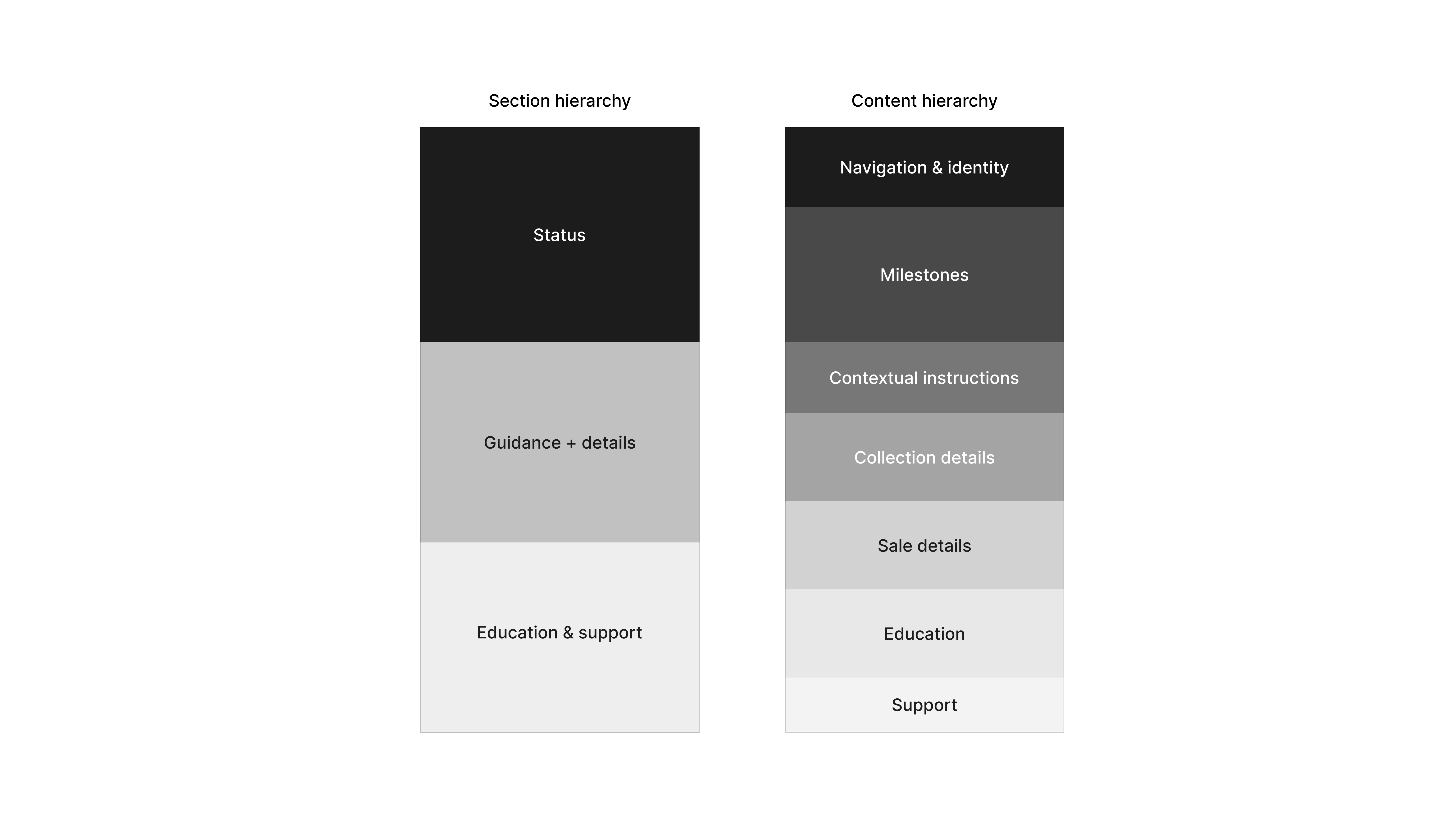
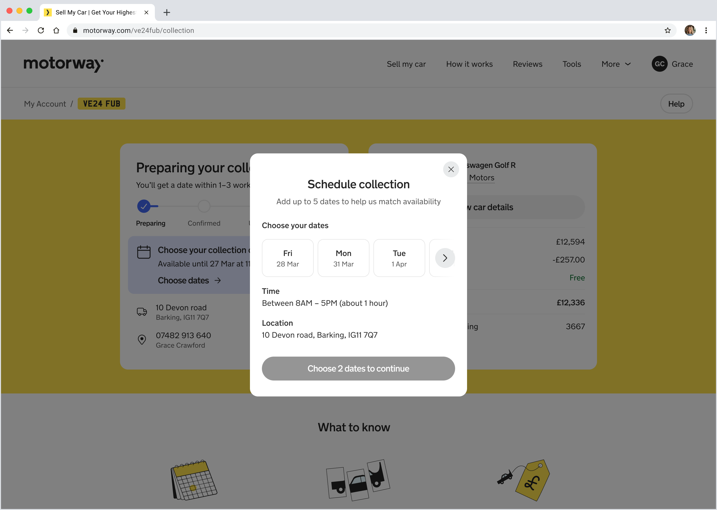
I had an idea of a guidance module: a lightweight, contextual surface that appears only when the seller needs clarity or direction. It's designed around three content categories, each tied to a specific moment in the journey and a specific type of behaviour we needed to support.
To reinforce its role, the guidance module adopts a notification-bar–style treatment that distinguishes time-sensitive context from the more permanent data surfaces beneath it.
The module later became a shared pattern adopted by Payments to surface negative-equity cases, validating the hierarchy and proving the design decision scaled across new operational moments without adding noise to the core journey.
The last mile experience launched in Q2 2025 without any CRM or marketing. The project helped define Motorway's trust and transparency vision, and created an entirely new product vertical. See the desktop experience below:
Outcome
- Reduced support enquiries by 32%: This allowed the support team to scale without hiring more people, directly increasing Motorway's profit margins
- Reduced dealer-contact issues by 27%: Dealers were happier and could spend more time bidding and running their business
- Drove 56% organic adoption: Launched without CRM or marketing push, validating that the product solved a genuinely felt need
Reflection
The hardest part was finding the product truth across a landscape of operational nuance and legacy behaviours: I had to consistently advocate for building the future we wanted rather than mirroring the present. What surprised me most was how long this problem had existed without being prioritised. The breakthrough was a vision storyboard focused on the why and the what, not the how. It taught me that strategic storytelling is as critical as design craft.