Document verification was one of the highest-cost steps in Motorway's seller journey: failures were common, guidance was unclear, and sellers blamed Motorway when documents were rejected. With no PM or backend support, I led a fast, content-led sprint that reframed it as a guided, confidence-building experience.
My Contributions
- Led a zero-PM, zero-backend design sprint end to end
- Redesigned photo guidance from a blocking modal to an always-visible reference
- Developed a scalable document guidance framework with the content designer
- Created a contextual support tile from the most frequent seller concerns, which was later adopted across the product
Research learnings
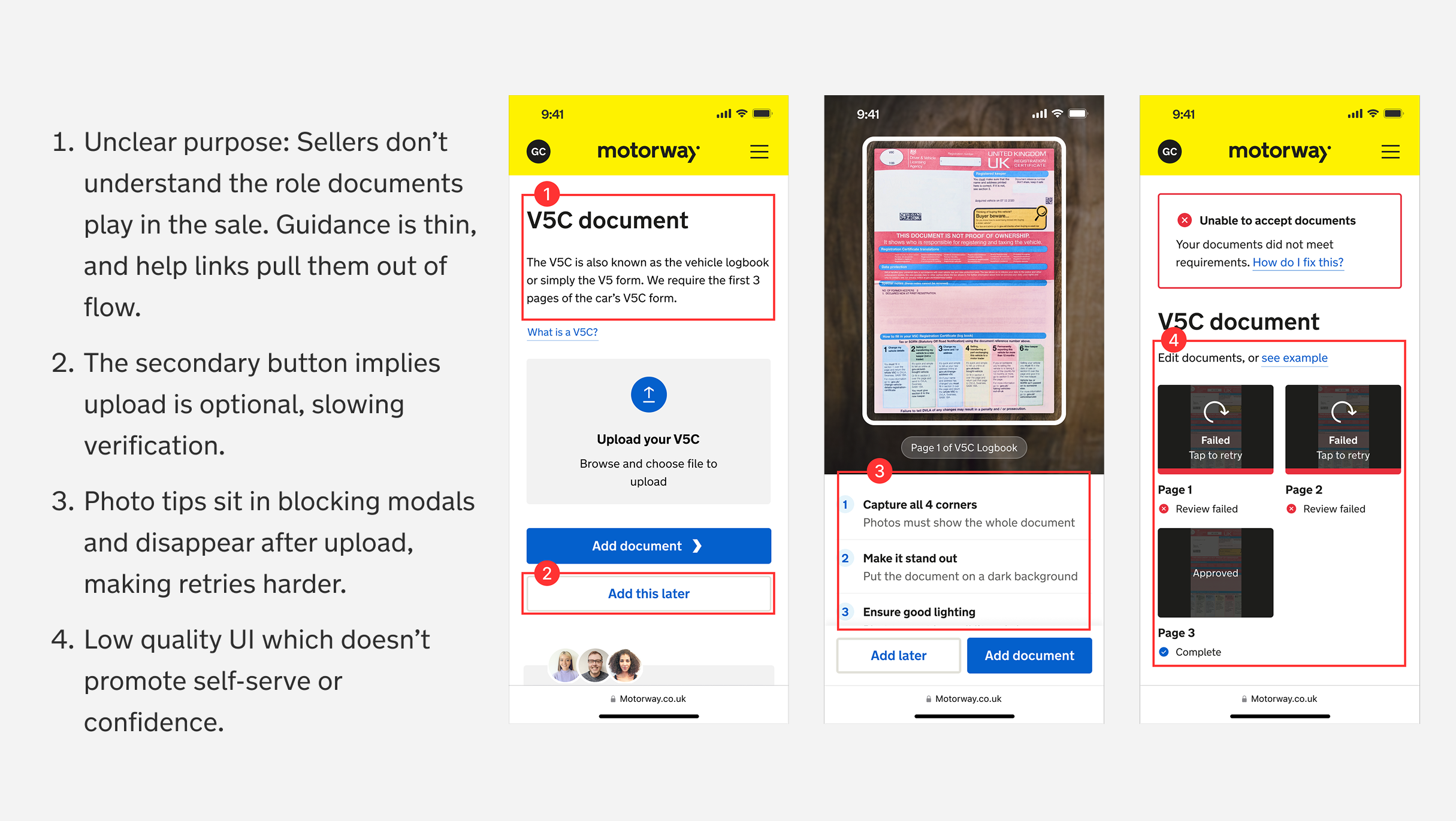
Analysing submitted photos and failure reasons identified recurring patterns:
- Sellers were hiding sensitive data, making verification impossible
- Low-quality, cropped, dark photos and missing pages led to frequent rejections
- Mismatched details (e.g. names not aligning with records)
Design challenge
I framed the work around one question: What are the smallest, most impactful changes we can make to improve the upload experience?
I saw an opportunity to drive quick improvements through content-led solutions. This approach allowed us to refine clarity, guidance, and usability with minimal FE engineering effort. I looped in our UX content designer and together, addressed the user needs.
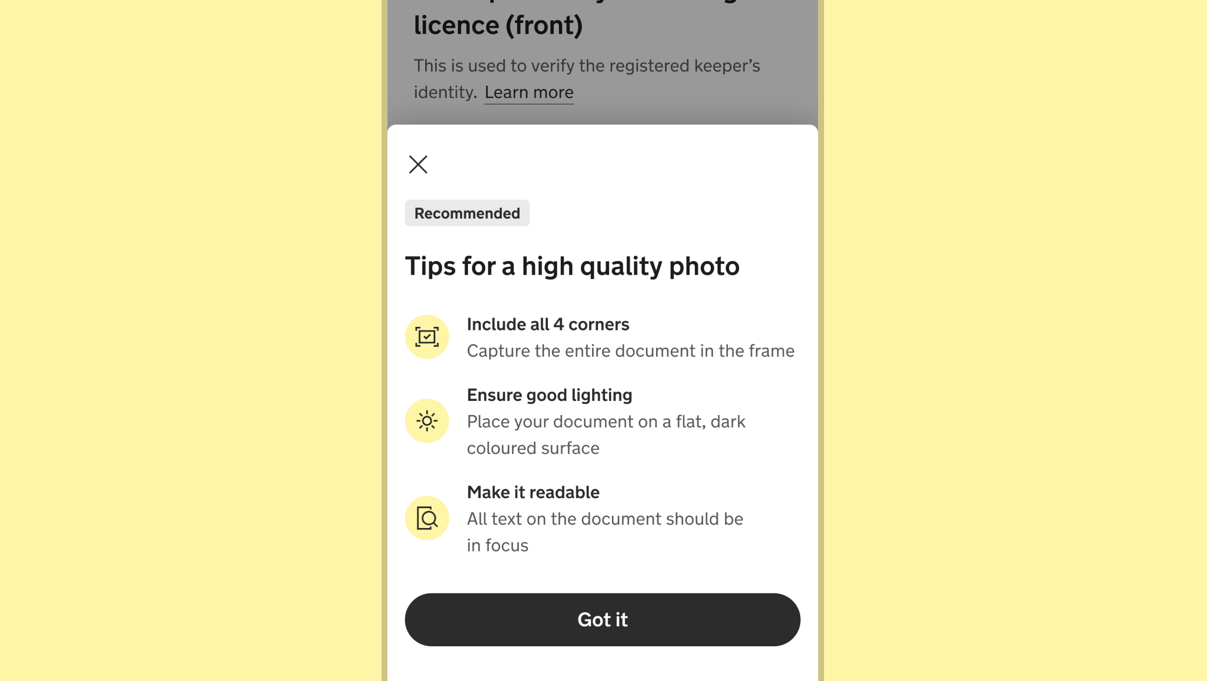
Priority 1: Helping sellers understand what 'good' is
Sellers were being forced to dismiss a persistent modal every time they added a photo — up to four times for core documents alone. I replaced this with a tile that stayed visible as a reference point. On mobile, I used a bottom sheet that appeared only on the first upload. The result: sellers could cross-reference guidance at any point rather than relying on memory, and help was surfaced when needed rather than blocking the flow.
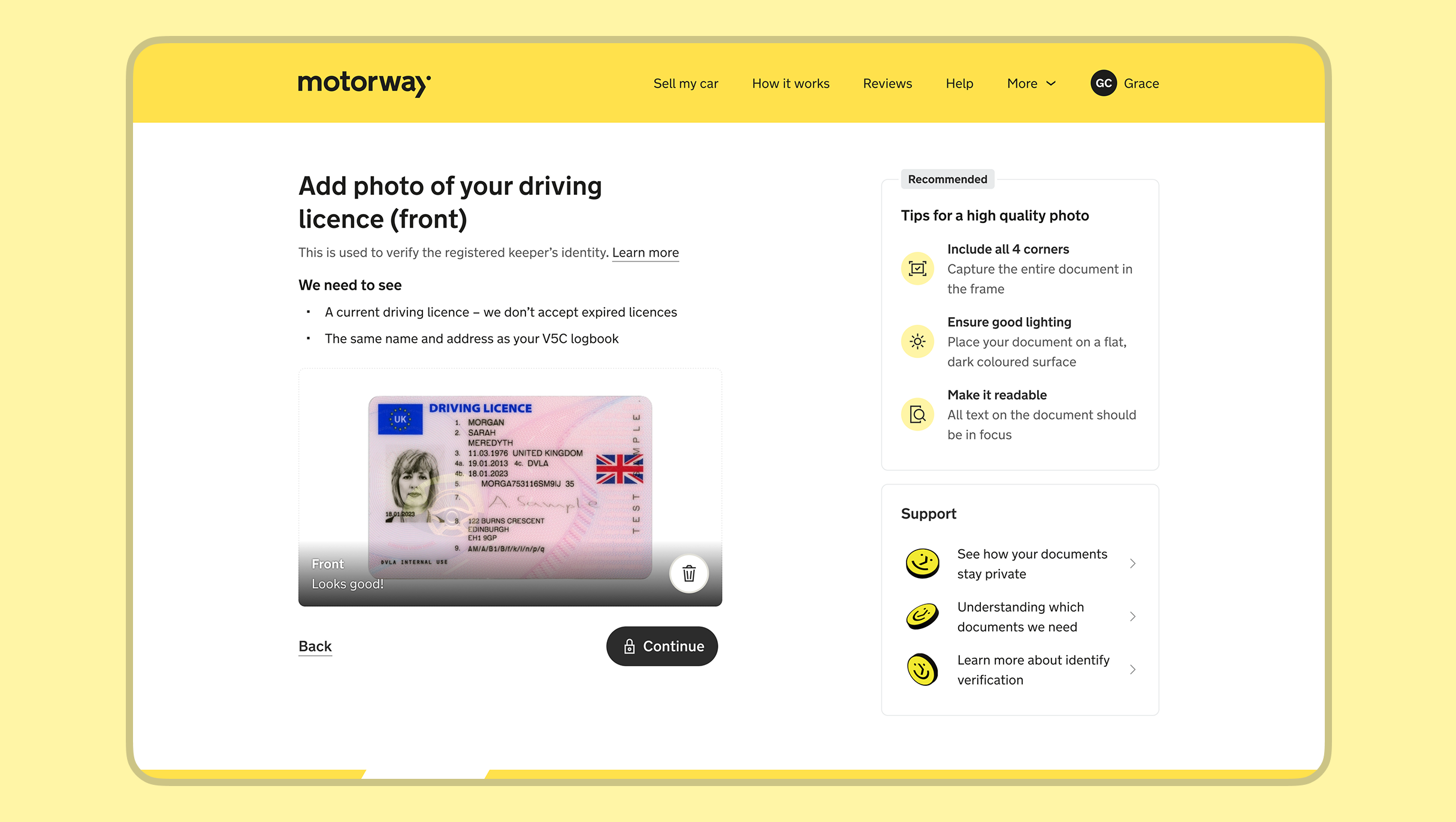
Priority 2: Clarifying the need for the document
Working with a content designer, I developed a scalable guidance framework that clarified what document was needed, why it was required, and what specifics to look out for — including things like expiration date rules. The pattern was adopted by other product teams, ensuring consistent guidance across the product, help centre, and support.
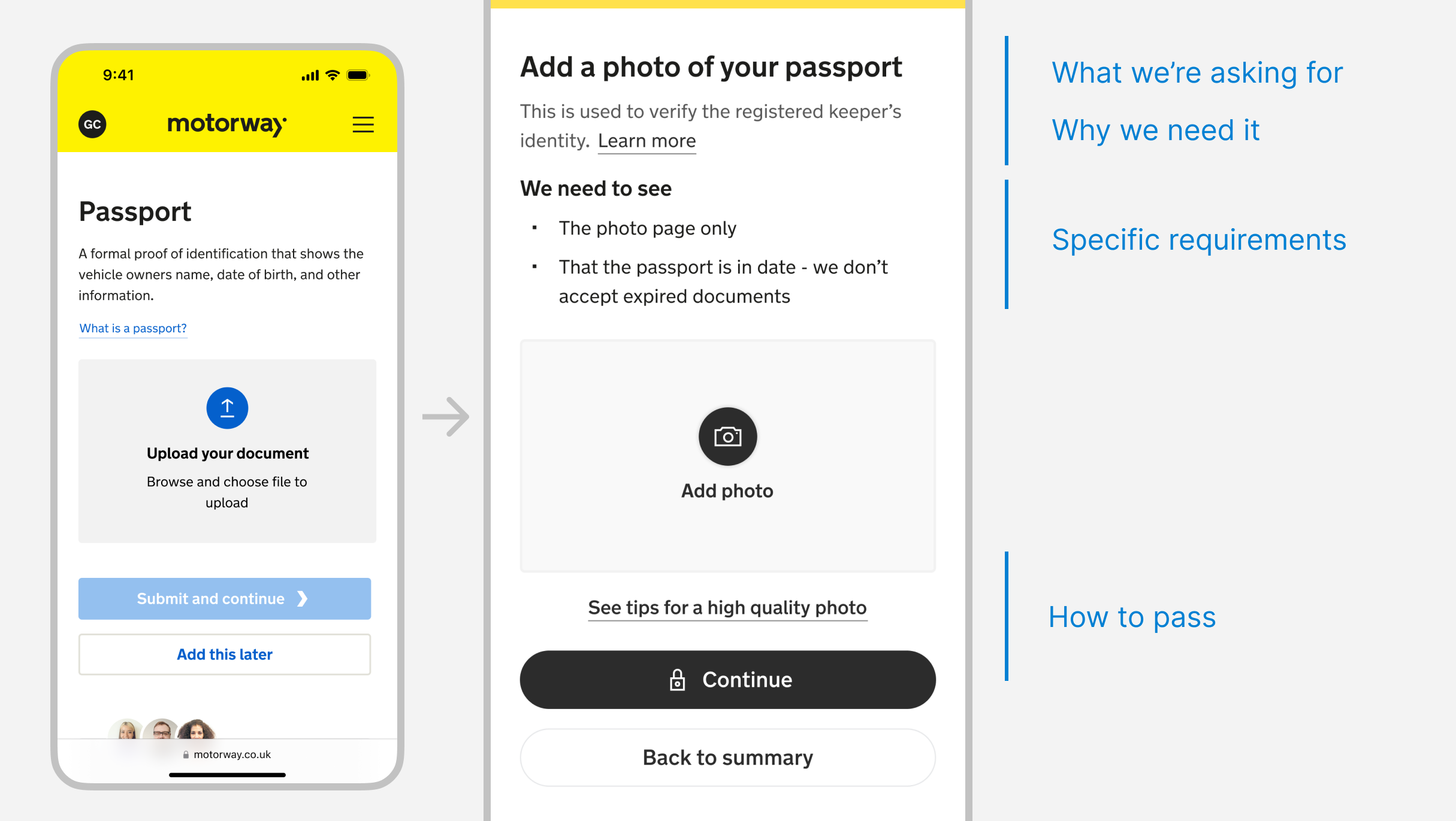
Priority 3: Proving support and safety reassurances
Informed by seller feedback and support logs, I replaced generic contact links with a support tile surfacing the three most frequent seller concerns, paired with relevant help centre articles. I also added a lock icon to the submission button to address anxiety around document privacy.
Outcome
- Improved first-time approval rates by 7%: Sellers submitted better photos first time, reducing rejection loops
- Reduced average verification time by 3 hours: Clearer guidance meant fewer back-and-forth support interactions
- UI pattern adopted across the product: The document guidance framework was picked up by other teams, proving lightweight content-led solutions could scale